Increasing e-learning engagement
Blue Canoe Learning is a Bellevue-based education startup. The Blue Canoe app helps learners with English language pronunciation using the award-winning Color Vowel System–a system that combines physical movement, auditory cues, and visual reinforcement.
My contributions
Designed and validated a mobile app feature that increased the target event by 8%
Conducted generative research with learners to understand motivations and pain points
Aligned the product leadership, engineering, and the education team around iterations of the solution
Ran evaluative research on a prototype with the target audience to identify any concerns and confusion
Problem
How might we increase the frequency of learners returning to the app to practice?
One of our product goals was to increase the number of daily of users. Additionally, the education team recommended at least 10 minutes of pronunciation practice each day to see improvements in pronunciation.
Process
Outcome-focused
I’m a big fan of the Opportunity-Solution Tree that I learned about from following Teresa Torres. It’s a product idea framework that keeps measurable outcomes and user research front and center. In this case, the organization’s measurable, desired outcome was an increase in the frequency of learners meeting their daily practice goal (~10 minutes).
Previously, I conducted generative research interviews with moderately engaged users. The question, “Can you walk me through what you do when you open the app?,” signaled that some learners were confused about what to practice to meet their goals. Other learners had created their own structured system they used each day. These related affinities led to the opportunity, “I want to be guided on what I need to do to improve”.
The solution we experimented on in this case was “Recommended activities / lessons”. The hypothesis was that learners would come back more frequently if we told them exactly what to do to meet their goals as soon as they opened the app.
Iteration and validation
After discussing feasibility with engineering and efficacy with the education team, I did competitive research on mobile task apps in product categories such as fitness, productivity/todos, and of course language learning. I discovered that many apps used a checklist-like interface combined with a calendar or streak information.
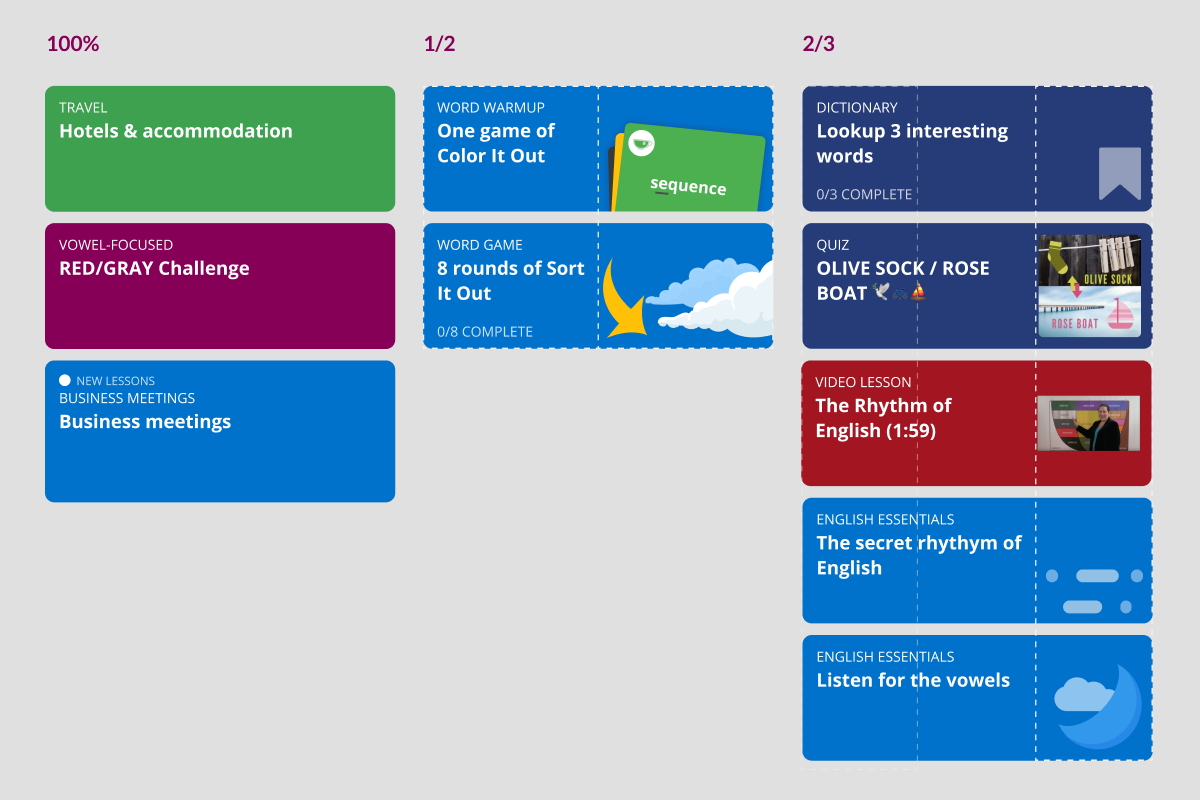
A new landing screen
I made a simple, tappable prototype in Figma. Next, I setup moderated sessions with current learners to look for feedback on the feature. We walked through how the learners currently choose activities for practice and then showed them the prototype.
User flow
The Blue Canoe app is made up of 7-8 pronunciation activities. The daily plan feature addresses a major pain point by deeplinking into recommended activities for the learners.
The main observations from the sessions:
Completing the daily goal was mentioned as a motivation in all of the interviews
The learner pain point was confirmed: “Which activities will meet my daily goal?”
The participants responded well to the prototype.
All participants intuitively tapped the new recommended activities and could still easily find the old browse view.
Some participants were concerned about why they were seeing particular activities
Incorporating the prototype feedback, I added more descriptive text to the recommended activities so it was clear why the learner was seeing that particular activity. The product team decided to proceed to build the feature in an upcoming sprint.
Preparing the cloud and app
In preparation for development on the app, I worked with a backend engineer and the education team to design the recommendation system that would populate the daily plans. Using pre-defined templates was smaller in scope so I created 7 templates that would be rotated and populated with different activities.
Next, I processed my Figma file for the app developers. I ensured the margins and spacing were consistent, defined the card designs for the various activities, and created reusable components for the entire UI.
Response and future considerations
The feature was released in March of 2020. In the month after its release, it showed an 8% increase in daily goals met and an 8% increase in session starts. The DAU/MAU (daily active users / monthly active users) showed ~10% increase.
In hindsight, I wish we would have held off on including the weekly calendar above the new plans at launch–or released the feature to a small cohort first to uncover any bugs we missed in testing. It turned out that our calendar did not accurately reflect the learners’ past activity. The increased visibility of the calendar highlighted an existing problem and caused a negative experience for many learners.
Now that the calendar is fixed, we are currently testing functionality that allows learners to load a new recommendation immediately after the current one is complete. We hope this will improve the stickiness of the app even more.


